Transfer Landing Page A/B Testing:
Optimizing Conversion through UX Design
Transforming a crucial enrollment pathway through data-driven design decisions and strategic A/B testing.
Client
Champlain College
Year
2025
Role
UX Design, A/B Testing, Analysis
Project Overview
Analytics data revealed that Champlain College’s Transfer landing page was underperforming. As Web Manager, I conducted a comprehensive UX analysis of the Transfer landing page specifically and developed an A/B testing strategy to identify improvements that would optimize conversion rates while maintaining the college’s brand integrity. This case study focuses on the Transfer landing page optimization project.
The Challenge
When analyzing conversion metrics, we discovered a concerning trend: the Transfer landing page was experiencing lower conversion rates than expected. This presented a significant challenge as transfer students are a key demographic for Champlain College’s enrollment goals.
The specific challenges included:
- Ensuring mobile responsiveness while maintaining conversion effectiveness
- Understanding why the Transfer page was underperforming despite following brand guidelines
- Identifying which specific elements were contributing to reduced conversion rates
- Developing a testing methodology that would produce actionable insights
- Creating design variations that would increase conversions without compromising the user experience
The Process
Heuristic Evaluation
Evaluated key landing pages against Nielsen’s Usability Heuristics, focusing on factors like user control, consistency, and error prevention. Key finding included issues with:
- Match Between System and Real World: Generic language not aligned with transfer students’ specific needs
- Recognition Rather Than Recall: Important information buried below the fold
- Aesthetic and Minimalist Design: Content-heavy approach created cognitive overload
UX/UI Audit
Conducted a comprehensive audit of the landing page focusing on specific aspects:
- User experience heuristics and intuitive navigation
- Form placement and design optimization
- Mobile user experience and responsive behavior
- Value proposition clarity and messaging hierarchy
- Conversion optimization elements and decision pathways
Variant Design
Developed testing variants based on key principles of landing page optimization:
- Above-the-fold optimization with clear value proposition
- Concise written copy
- Addition of a personal element (transfer counselor)
- Step-by-step process visualization
- Form element balance
- Implementation of social proof elements
A/B Testing Implementation
Created a parallel “transfer-alt” page to implement the variant design while maintaining the original page for comparison. This approach allowed for:
- “Champion vs. Challenger” testing
- Collection of comprehensive analytics data
- Analysis of user engagement patterns and conversion paths
- Create significant shifts in user behavior
- Address multiple conversion barriers at once; uncover big wins faster
- Accelerate the testing timeline
Design Comparison
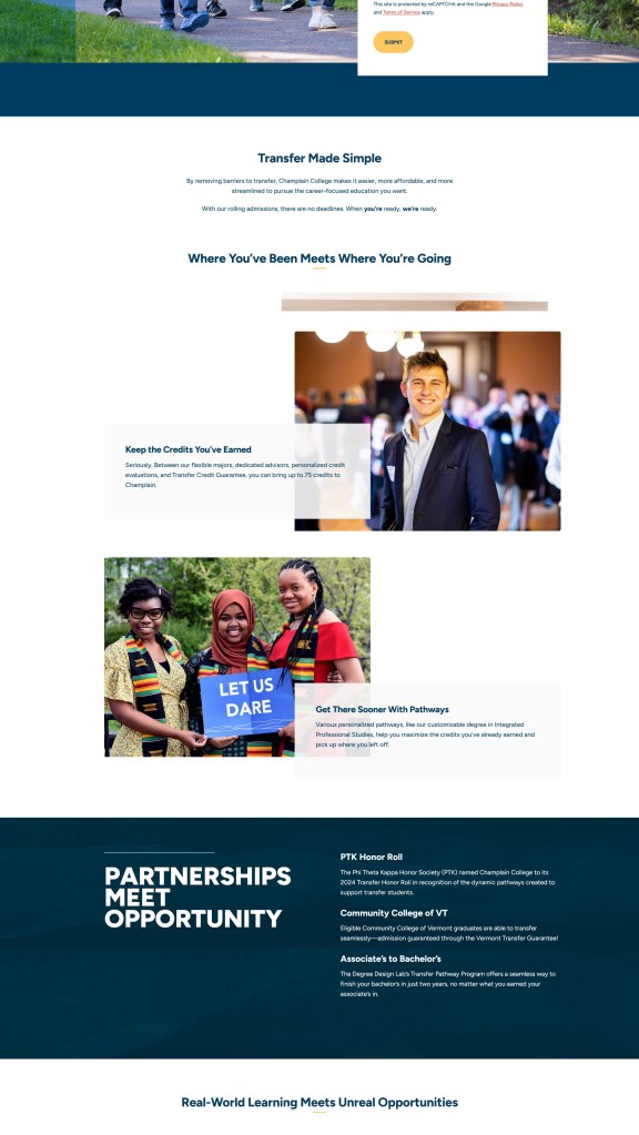
Control Version
The original design at champlain.edu/explore/transfer had several UX issues:
- No dedicated contact person identified for transfer students
- Generic headline “Welcome What’s Next” lacks transfer-specific value proposition
- Content-heavy approach requiring significant scrolling
- Information architecture emphasizes features over benefits
- Multiple competing focal points without clear hierarchy
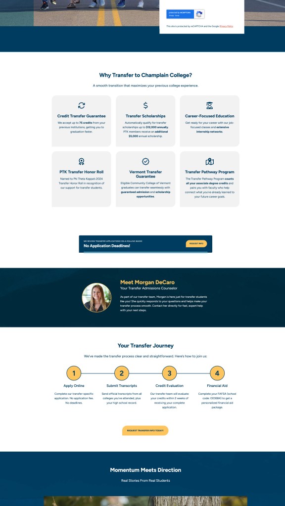
Test Variant
The test variant at champlain.edu/explore/transfer-alt implemented several key improvements:
- More strategic information hierarchy prioritizing decision-making factors
- Direct, benefit-focused headline: “Transfer to Champlain: Where Earned Credits Meet a Faster Finish”
- Clear “Why Transfer to Champlain College?” value proposition with scannable benefit icons
- Three-column layout presenting key benefits concisely
- Introduction of a specific transfer counselor with photo, creating a personal connection
- Step-by-step transfer journey with clear deadlines and expectations
- List of common FAQs
Key Takeaways
This A/B testing project revealed several critical insights about effective landing page design for higher education:
- Direct, benefit-focused messaging is essential: Changing from the generic “Welcome What’s Next” to the specific “Transfer to Champlain: Where Earned Credits Meet a Faster Finish” created an immediate connection with the target audience.
- Information hierarchy impacts conversion: The reorganization of content to prioritize transfer-specific benefits and the addition of clear value propositions significantly improved engagement metrics.
- Personal connection drives action: The addition of a specific transfer counselor with a photo created a human touchpoint that prospective transfer students could connect with, increasing their comfort with the next steps.
- Clear process visualization matters: Breaking down the transfer journey into concrete steps with deadlines reduced uncertainty and made the path forward more approachable.
- Social proof reinforces credibility: Highlighting credentials like the PTK Honor Roll recognition and specific transfer partnerships strengthened Champlain’s positioning as a transfer-friendly institution.
