Mobile Experience Enhancement Project
Balancing form visibility with compelling visuals to create an engaging mobile experience for Gen Z prospective students.
Client
Champlain College
Year
2025
Role
UX Analysis, Mobile Optimization
Project Overview
As part of a comprehensive landing page optimization effort, I identified a critical gap in our mobile user experience. Our analysis revealed that 75% of Gen Z users prefer their mobile devices, yet our landing pages were not optimized for mobile engagement.
This focused mobile enhancement project addressed key issues in our landing page design, particularly how forms dominated the mobile view at the expense of compelling imagery and visual storytelling. Working collaboratively with our web development team, I led the effort to create a better balance between form visibility and emotional connection on mobile devices.
The Challenge
Through a comprehensive heuristic evaluation of four key landing pages (Transfer, Meet Champlain, Game Studio Experience, and Digital Forensics), I identified several critical mobile-specific issues:
- Form dominance: Forms dominated the mobile view at the expense of compelling imagery
- Missing visual storytelling: We were missing a visual storytelling opportunity for our Gen Z audience
- Visual hierarchy problems: Program-specific imagery was pushed below the fold on mobile devices
- Content imbalance: Student work examples and campus imagery were minimized or pushed below the fold
- Form visibility issues: No contrasting colors for form elements on mobile devices
These issues represented a significant gap, especially considering that research showed 75% of Gen Z users prefer their phone as their device of choice. Our mobile experience needed to be optimized to align with our audience’s preferences and behaviors.
The Process
Heuristic Evaluation
I conducted a comprehensive analysis of four key landing pages using Nielsen’s 10 Usability Heuristics as a framework:
- Evaluated the Game Studio, Digital Forensics, Transfer, and Meet Champlain landing pages
- Identified common mobile usability issues across all pages
- Documented specific mobile experience shortcomings in visual hierarchy and form prominence
Mobile UX Analysis
I focused on five key areas critical to mobile conversion:
- User experience heuristics for mobile devices
- Form placement and design on small screens
- Mobile-specific user experience patterns
- Value proposition clarity on limited screen space
- Conversion optimization elements for mobile users
Solution Development
Based on my findings, I developed specific mobile enhancement solutions:
- Created mobile-first design mockups that balanced form visibility with compelling visuals
- Designed enhanced form elements with contrasting colors for better visual hierarchy
- Developed visual storytelling elements that would appear near the form
- Optimized imagery for mobile without sacrificing emotional impact
Decisive Implementation
Based on the comprehensive analysis and clear findings, I collaborated with the web development team to take decisive action:
- Presented findings and recommendations to the development team
- Provided detailed specifications for mobile-specific CSS optimizations
- Directed the implementation approach for the mobile experience enhancements
- Conducted post-implementation analytics to measure effectiveness
Before & After
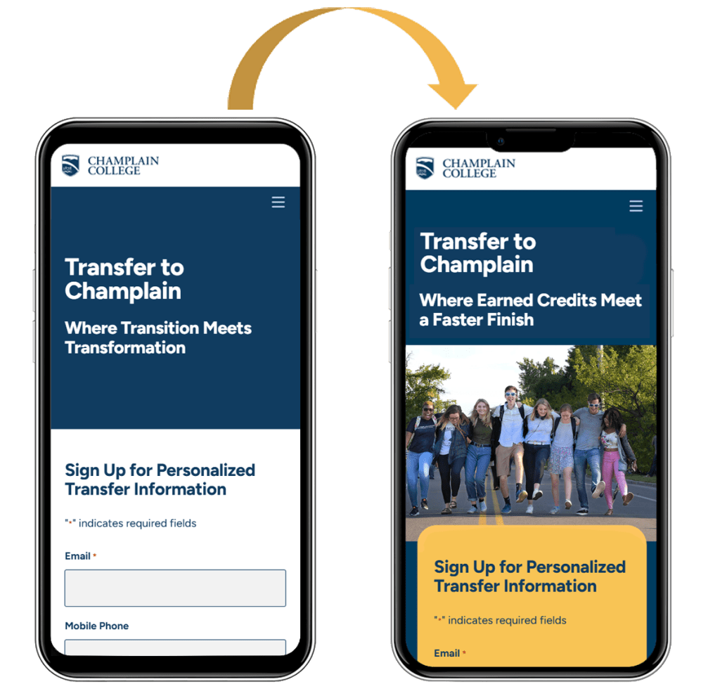
The enhanced mobile experience implemented four key improvements identified in our analysis:
- Mobile-first design that balances form and visuals
- Enhanced form visibility with contrasting colors and clear visual hierarchy
- Visual storytelling elements strategically positioned near conversion points
- Optimized imagery for mobile without sacrificing emotional impact
Key Takeaways
This Mobile Experience Enhancement project revealed several critical insights about effective mobile design for higher education marketing:
- Mobile-first approach is essential: With 75% of Gen Z preferring mobile devices, designing for mobile as the primary experience rather than as an adaptation of desktop ensures optimal user engagement.
- Visual balance is critical: Finding the right balance between form visibility and compelling imagery creates an emotional connection while still driving conversions.
- Visual hierarchy needs rethinking for mobile: Elements that work well on desktop often need completely different treatment on mobile to maintain their impact and guide users to conversion points.
- Contrasting colors enhance form visibility: Using contrasting colors for form elements significantly improves their visibility and prominence on mobile devices.
- Visual storytelling must be preserved: Optimizing imagery for mobile without sacrificing emotional impact maintains the brand promise and student experience narrative.
- Cross-functional collaboration is key: Working closely with the web development team ensured that design recommendations were technically feasible and properly implemented.
- Data-driven decision making delivers results: Using analytics to guide decisions and measure outcomes provided concrete evidence of the project’s success and ROI.
This project was identified as Priority #1 in our landing page optimization strategy because it directly addressed how our prospective students primarily engage with our content. By leading this effort to implement mobile-specific enhancements and measuring the impact through careful analytics, we created a more engaging and effective experience that better serves our Gen Z audience.
 Sherry White | Web Professional